I'd like to make it very clear, to any reader, that this anaylsis is just
an observation of the data. This is not a political statement of any kind.
This project used a lot a of useful methods. It is not intended to favor or
besmirch any candidate, party, or political belief. I did this to see what
we could infer from the data.
I started with a few innocuous questions after watching a short news segment
that showed some polling results. If I recall correctly, it showed that 77%
of republicans were apprehensive to get vaccinated. I thought this number
was shockingly high.
Weeks later I saw an interview where former president Donald Trump advised
people to get vaccinated—and also put some misinformation to rest pertaining
to the vaccine itself. He was more direct in this interview than he had
been in the past. This was a bit eyebrow raising based on the change of tune.
This brought on a few questions for me—and I wanted to explore them
by comparing 2020 election and COVID-19 data.
Why compare the 2020 election and COVID-19 data? One of the best analytic works
on political behavior I've read was An Economic Theory of Democracy
by Anthony Downs (1957). It's extremely dense but a good read. Essentially, his
thesis was "parties formulate policies in order to win elections, rather than
win elections in order to formulate policies". I'm not going to go into
as much depth as Downs did—this is not a thesis. Although, I do pose a
similar idea may be applied to what polititians do or say to influence
constituent behavior—here said behaviour is vaccinating.
So, why would former president Donald Trump change his tune so drastically?
Vaccinated people are very well protected from COVID-19. The ratio of vaccinated
deaths to unvaccinated deaths are far in favor of the vaccinated (1). What is
important here is the voting population. I've seen some reports that say up
to 91% of democrats and 60% of republicans are vaccinated (2). We may infer that
of the deaths from the voting population, most are republicans.
I think this may contribute to an explanation of why former President
Trump has changed the way he talks in public about the vaccine.
Resources for further reading:
(1) How do death rates from COVID-19 differ between people who are vaccinated and those who are not?
(2) NBC News poll shows demographic breakdown of the vaccinated in the U.S.
So, what I plan to do here is:
1. Scrape the data
--Election data from MIT
--Covid data from Johns Hopkins University
--Vaccination data from the US Center for Disease Control and Prevenetion
2. Wrangle the data so that I have compatible FIPS codes across all states
and counties.
3. Look at some relationships between a varity of variables (with an emphasis on swing states)
Analysis:
By this point we have several dataframes that contain many variables. These dataframes have uniform FIPS columns. This tells us where the data is in the US. We can pull data from different dataframes to do specific things like; plots, descriptive statistics, or maybe inferential statistics.
'''
What is most important here is the swing states. Although first let us look at
all the states as a whole.
'''
def merge_pol_vac(pol_df, vac_df, cases_df, deaths_df):
    '''
    First I will merge the political data with vac_data by percent of 18 to 64
    and 65plus, also the current cases and deaths to date.
    '''
    vac_df = vac_df[['FIPS', 'Series_Complete_Pop_Pct']]
    cases_df = cases_df[['FIPS', '12/29/21']] #pulls totals over time from 12/29/21
    deaths_df = deaths_df[['FIPS', 'Population', '12/29/21']]

    pol_df = pol_df.merge(vac_df, on='FIPS')
    pol_df = pol_df.merge(cases_df, on='FIPS', suffixes=('_cases', '_deaths'))
    pol_df = pol_df.merge(deaths_df, on='FIPS', suffixes=('_cases', '_deaths'))
    pol_df['pct_votes'] = pol_df.groupby(['FIPS', 'county_name', 'candidate'])['pct_votes'].transform('sum')
    pol_df['tot_state_votes_for_can'] = pol_df.groupby(['state', 'candidate'])['candidatevotes'].transform('sum')
    pol_df['tot_deaths_by_state'] = pol_df.groupby(['state' ])['12/29/21_deaths'].transform('sum')
    return pol_df
merged_pol_vac = merge_pol_vac(df_pres, df_vaccine, df_cov_cases, df_cov_deaths)

'''
What I need now is cases and deaths per capita. So Here I will add that column.
'''
def add_per_cap(df):
    df['per_capita_deaths'] = df['12/29/21_deaths']/df['Population']*100000
    df['per_capita_cases'] = df['12/29/21_cases']/df['Population']*100000
    return df
merged_pol_vac = add_per_cap(merged_pol_vac)

'''
Now let us isolate the swing states.
'''
def get_swing_states(df):
    swing_states = ['ARIZONA', 'COLORADO',
                    'FLORIDA', 'GEORGIA',
                    'MICHIGAN', 'NEVADA',
                    'NEW HAMPSHIRE', 'NORTH CAROLINA',
                    'OHIO', 'PENNSYLVANIA', 'WISCONSIN']
    df = df.loc[df['state'].isin(swing_states)]
    df = df[['state', 'county_name', 'FIPS',
             'candidate', 'pct_votes',
             'Series_Complete_Pop_Pct',
             '12/29/21_cases', 'Population',
             '12/29/21_deaths', 'per_capita_deaths',
             'per_capita_cases', 'tot_state_votes_for_can',
             '12/29/21_deaths', 'tot_deaths_by_state']]

    df.drop_duplicates(inplace=True)

    return df
df_sw = get_swing_states(merged_pol_vac)

'''
So now we pull the swing states tot_state_votes_for_can and tot_deaths_by_state;
and compare by how much each candidate won or lost by.
'''
def get_victory_by(df):
    df = df[['state','candidate','tot_state_votes_for_can', 'tot_deaths_by_state']]
    df.drop_duplicates(inplace=True)
    temp1 = df.iloc[0::2, 2]
    temp2 = df.iloc[1::2, 2]

    d_wins = temp2.values - temp1.values
    b_wins = temp1.values - temp2.values

    result = [None]*(len(temp1)+len(temp2))
    result[::2] = b_wins
    result[1::2] = d_wins
    df.insert(4, 'win_loss_diff', result)
    return df
df_sw_vic = get_victory_by(df_sw)
Now we have a dataframe that looks like the below—along with several others.
Although there is still a lot of time before 2024. There is still a lot we
don't know. We don't know any of the political affiliations of deaths reported
nor if they are active voters. There is too much unknown to make a solid
inference.
Although, if the numbers continue to rise and most of the voting age deaths
are republican—it would seem that it would benifit Trump to tell his base
to vaccinate.
#This data observers the entire statement

               state          candidate tot_deaths_by_state  win_loss_diff
140          ARIZONA  JOSEPH R BIDEN JR              144864        10457.0
143          ARIZONA     DONALD J TRUMP              144864       -10457.0
946         COLORADO  JOSEPH R BIDEN JR               20396       439745.0
947         COLORADO     DONALD J TRUMP               20396      -439745.0
1096         FLORIDA  JOSEPH R BIDEN JR               73946      -371686.0
1097         FLORIDA     DONALD J TRUMP               73946       371686.0
1230         GEORGIA  JOSEPH R BIDEN JR              241536        12670.0
1234         GEORGIA     DONALD J TRUMP              241536       -12670.0
3992        MICHIGAN  JOSEPH R BIDEN JR               57632       154188.0
3993        MICHIGAN     DONALD J TRUMP               57632      -154188.0
4726          NEVADA  JOSEPH R BIDEN JR               16812        33706.0
4727          NEVADA     DONALD J TRUMP               16812       -33706.0
4760   NEW HAMPSHIRE  JOSEPH R BIDEN JR                3858        59277.0
4761   NEW HAMPSHIRE     DONALD J TRUMP                3858       -59277.0
5012  NORTH CAROLINA  JOSEPH R BIDEN JR              154712       -74481.0
5016  NORTH CAROLINA     DONALD J TRUMP              154712        74481.0
5990    PENNSYLVANIA  JOSEPH R BIDEN JR               73008        80555.0
5991    PENNSYLVANIA     DONALD J TRUMP               73008       -80555.0
7898            OHIO  JOSEPH R BIDEN JR               57548      -475669.0
7899            OHIO     DONALD J TRUMP               57548       475669.0
9960       WISCONSIN  JOSEPH R BIDEN JR               22238        20608.0
9961       WISCONSIN     DONALD J TRUMP               22238       -20608.0
Plots:
There are a few other things to look at. Like the relationship between counties that voted a majority for former president Trump or Biden and the percentage completed COVID-19 vaccinations for those counties.
'''
How corrolated is vaccinated population with votes for Trump?
'''
def lin_reg_cov_votes(df, candidate):
    '''
    A function to return a simple linear regression between 2 variables.
    data is defined in x and y assignment.
    '''
    title = 'Correlation of Counties That Voted Greater than 50% for {} and Percent of Total Pop Vaccinated'.format(candidate)

    df = df.loc[(df['pct_votes']>50) & (df['candidate']==candidate)]

    x = df['pct_votes'].replace(0, df['pct_votes'].mean()) #df_ana.iloc[row_start:row_stop, column]
    y = df['Series_Complete_Pop_Pct'].replace(0, df['Series_Complete_Pop_Pct'].mean() )

    slope, intercept, r, p, stderr = stats.linregress(x, y)

    line = f'Regression line: y={intercept:.2f}+{slope:.2f}x, r={r:.2f}'

    fig, ax = plt.subplots(figsize = (10,10))
    plt.figure(dpi=100)
    ax.plot(x, y, linewidth=0, marker='o', label=y.name)
    ax.plot(x, intercept + slope * x, label=line)
    ax.set_xlabel(x.name)
    ax.set_ylabel(y.name)
    ax.legend(facecolor='gray')
    ax.legend(frameon=True, loc='upper left')
    ax.set_title(title,
                  fontdict=None, loc='center', pad=None)
    plt.show()
    return
lin_reg_cov_votes(merged_pol_vac, 'DONALD J TRUMP')
Here is our output:
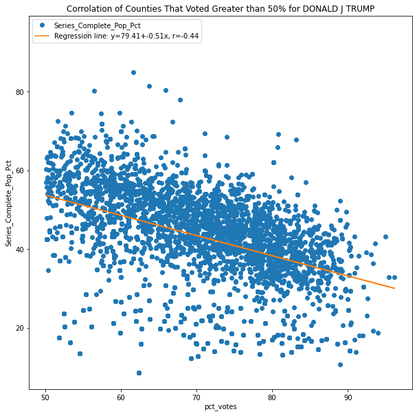 We can see there is a slight negative correlation between vaccinations by percent
of population and votes for Trump. It's a low correlation with a
correlation coeficient -.44 but it is correlated.
I ran the same for counties where biden won 50% or more of the vote by county.
lin_reg_cov_votes(merged_pol_vac, 'JOSEPH R BIDEN JR')
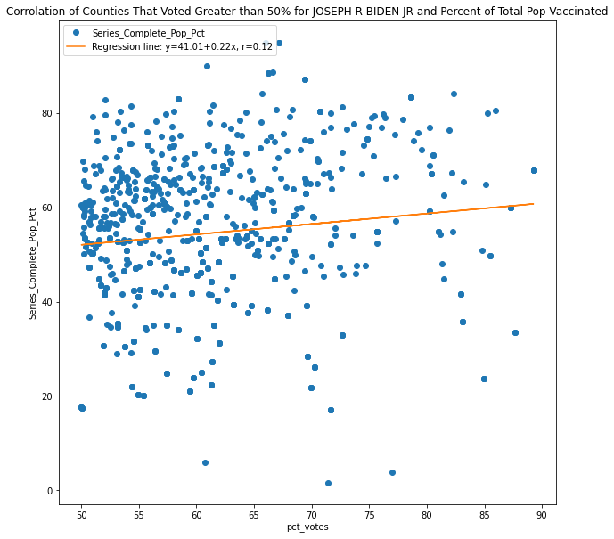 Interestingly, there is no correlation between counties that voted a majority
for Biden and vaccination by population percent. A correlation coefficient of
.12 is negligable.
I also want to look at the relationship of cases and deaths per capita to the completed vaccine percent of population.
def lin_reg_cov_data(x_col, y_col):
    '''
    A function to return a simple linear regression between 2 variables.
    data is defined in x and y assignment.
    '''
    title='Corrolation between total vaccinated population and Deaths per Pop/100k'

    x = x_col.replace(0, x_col.mean()) #df_ana.iloc[row_start:row_stop, column]
    y = y_col.replace(0, y_col.mean())


    slope, intercept, r, p, stderr = stats.linregress(x, y)

    line = f'Regression line: y={intercept:.2f}+{slope:.2f}x, r={r:.2f}'

    fig, ax = plt.subplots(figsize = (10,10))
    plt.figure(dpi=100)
    ax.plot(x, y, linewidth=0, marker='o', label=y.name)
    ax.plot(x, intercept + slope * x, label=line)
    ax.set_xlabel(x.name)
    ax.set_ylabel(y.name)
    ax.legend(facecolor='gray')
    ax.legend(frameon=True, loc='upper left')
    ax.set_title(title,
                  fontdict=None, loc='center', pad=None)
    plt.show()
  return
lin_reg_cov_data(merged_pol_vac['Series_Complete_Pop_Pct'].iloc[0::2],
              merged_pol_vac['per_capita_deaths'].iloc[0::2])
lin_reg_cov_data(merged_pol_vac['Series_Complete_Pop_Pct'].iloc[0::2],
              merged_pol_vac['per_capita_cases'].iloc[0::2])
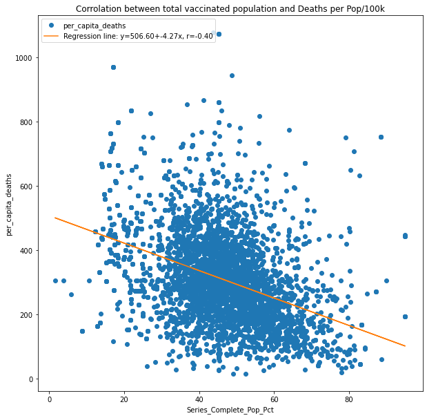 This shows that deaths decrease as vaccination by population percent increases.
Vaccination is not the only variable that influences deaths—although, it absolutly
contibutes to saving lives.
So, here's what we see when we compare vaccine percent and cases.
lin_reg_cov_data(merged_pol_vac['Series_Complete_Pop_Pct'].iloc[0::2],
                                merged_pol_vac['per_capita_cases'].iloc[0::2])
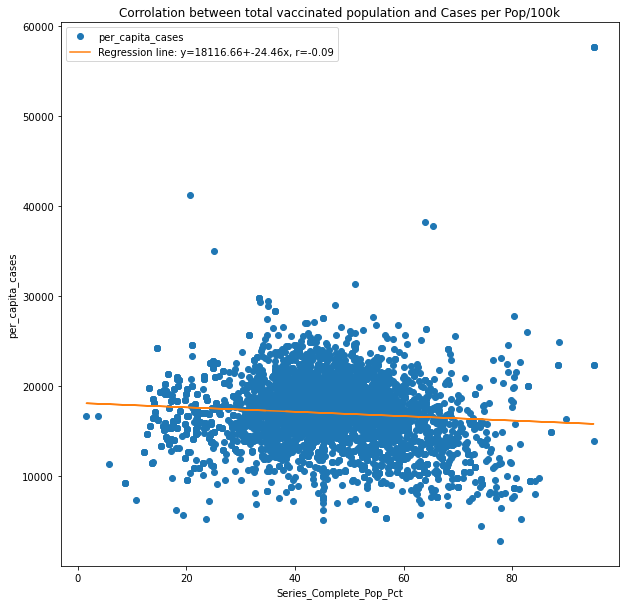 Why is there no correlation between reported cases and vaccine percent of population?
Because the vaccine isn't meant to keep you from getting COVID. It is meant to
keep you from getting deathly sick when you catch COVID.
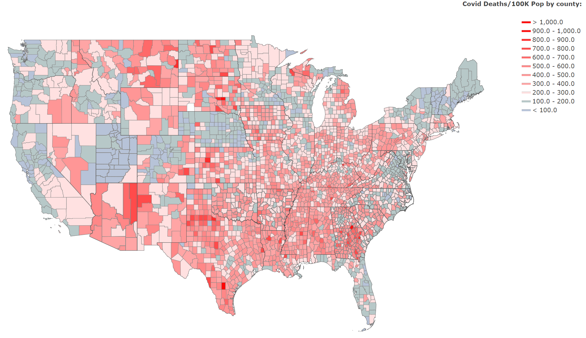
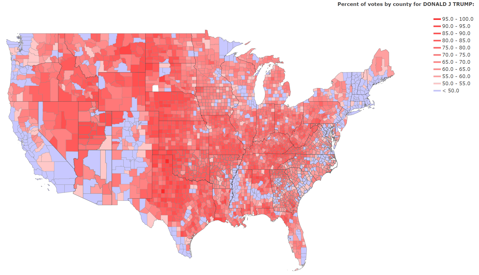
Another very interesting observation would be to look at the counties that voted for Trump and their deaths per100k population. We can visualize this with a map.
def plot_state_deaths_usa(df):
    '''
    Pass a dataframe to plot data by county.
    The column that houses county fips data must be named 'FIPS'
    '''
    fig = make_subplots(rows=1, cols=2)
    colorscale=[
        'rgb(183, 195, 216 )',
        'rgb(183, 200, 200 )',
        'rgb(255, 225, 225)',
        'rgb(255, 165, 165)',
        'rgb(255, 150, 150)',
        'rgb(255, 135, 135)',
        'rgb(255, 105, 105)',
        'rgb(255, 75, 75)',
        'rgb(255, 45, 45)',
        'rgb(255, 15, 15)',
        'rgb(255, 5, 5)',
        ]
    endpts = list(np.linspace(100, 1000, len(colorscale)-1))

    fips = df.FIPS
    values = df.per_capita_deaths

    fig = ff.create_choropleth(fips=fips, values=values,
                                legend_title='Covid Deaths/100K Pop by county:',
                                scope=['usa'],
                                county_outline={'color': 'rgb(135, 135, 135)', 'width': 0.5},
                                state_outline={'color': 'rgb(0,0,0,0)', 'width': 0.25},
                                show_hover=True,
                                colorscale=colorscale,
                                binning_endpoints=endpts,
                                )

    fig.layout.template = None
    fig.update_layout(
                        autosize=True,
                        width=2000,
                        height=1200,
                        margin=dict(
                            l=50,
                            r=50,
                            b=50,
                            t=50,
                            pad=1),
                        font=dict(size=20))
    fig.show()
    return
plot_state_deaths_usa(merged_pol_vac)


def plot_county_wins(df):
    '''
    Pass a dataframe to plot data by county.
    The column that houses county fips data must be named 'FIPS'
    '''
    fig = make_subplots(rows=1, cols=2)
    #endpts is for binning the data
    colorscale=[
                'rgb(200, 200, 255)',
                'rgb(255, 200, 200)',
                'rgb(255, 160, 160)',
                'rgb(255, 140, 140)',
                'rgb(255, 130, 130)',
                'rgb(255, 120, 120)',
                'rgb(255, 100, 100)',
                'rgb(255, 90, 90)',
                'rgb(255, 80, 80)',
                'rgb(255, 70, 70)',
                'rgb(255, 40, 40)',
                'rgb(255, 0, 0)',
                 ]

    trump_data = df.loc[(df['candidate']=='DONALD J TRUMP')]
    endpts = list(np.linspace(50, 100, len(colorscale)-1))
    fips = trump_data.FIPS
    values = trump_data.pct_votes
    fig = ff.create_choropleth(fips=fips, values=values,
                               legend_title='Percent of votes by county for DONALD J TRUMP:',
                               scope=['usa'],
                               county_outline={'color': 'rgb(135, 135, 135)',
                                               'width': 0.5},
                               state_outline={'color': 'rgb(0,0,0,0)',
                                              'width': 0.25},
                               show_hover=True,
                               colorscale=colorscale,
                               binning_endpoints=endpts,
                               )

    fig.layout.template = None
    fig.update_layout(
                        autosize=True,
                        width=2000,
                        height=1200,
                        margin=dict(
                            l=50,
                            r=50,
                            b=50,
                            t=50,
                            pad=1),
                        font=dict(size=20))
    fig.show()
    return
plot_county_wins(merged_pol_vac)
If you look at the output for the two plots next to each other you may notice that
the reported deaths per capita are a majority higher down the Appalachian region starting
in Pennsylvania and into the Bible belt—as are counties that voted a majority for Trump.
Thus, per capita the counties that voted Republican seem to be suffering more deaths
from COVID. I pose here that if more active voters who vote Republican are passing
away from COVID more than Democrat voters—this may increase the risk of Republicans
losing states. Specifically Georgia and North Carolina. This is particularly
possible if most Democrats are vaccinated whilst most Republicans are not.
